Building a Responsive Grid with Foundation
Yesterday I introduced SMACSS and did my best to give a high level overview of its main ideas. I'm using it on my current project and I'm really enjoying it so far. There's just something about having things codified by someone with more experience that gives me immense comfort. When I feel confused I can refer back to those docs and sort out what would be the best path. Standing on the shoulders of giants and all that jazz ;)
Today I want to talk about a CSS framework called Foundation, written by the team at ZURB. Unlike SMACSS, Foundation is an actual library of modular code ready to help you quickly prototype your project. The two aren't mutually exclusive. You might think of Foundation as a shiny new toolbox but SMACSS is going to be your 'How To' manual, helping you implement all the new goodes that Foundation has to offer.
I'm sure many of you have heard of Bootstrap which is very similar and somewhat more popular than Foundation. I chose to use Foundation for this post because Bootstrap feels bloated to me, and I also didn't want to have to do everything in LESS. Don't get me wrong, I loves me some LESS and some SASS, but not everyone is comfortable with those tools and it's already a big ask to ramp up on a new CSS framework.
Since it's a little late in the evening I'm just going to dip my toe into some of what Foundation has to offer by quickly mocking up a very simple layout using their responsive grids.
Obviously nothing fancy, the main bits I want to explore are how easy it is to lay items out using the grid and how does it react on the iPhone.
Everything in its place
The first thing you should do, if you haven't already is to go to the Foundation site and download the package.
Let's make a new folder with an index.html file and bring over the javascripts and stylesheets folders from the Foundation package. Just to start out your new index.html file should look something like this:
<!DOCTYPE html>
<html lang="en">
<head>
<meta charset="utf-8" />
<!-- Set the viewport width to device width for mobile -->
<meta name="viewport" content="width=device-width" />
<title>Responsive Grid Prototype</title>
<!-- Included CSS Files -->
<link rel="stylesheet" href="stylesheets/foundation.css" />
<link rel="stylesheet" href="stylesheets/app.css" />
<script src="javascripts/modernizr.foundation.js"></script>
</head>
<body>
<!-- container -->
<div class="container">
<div class="row">
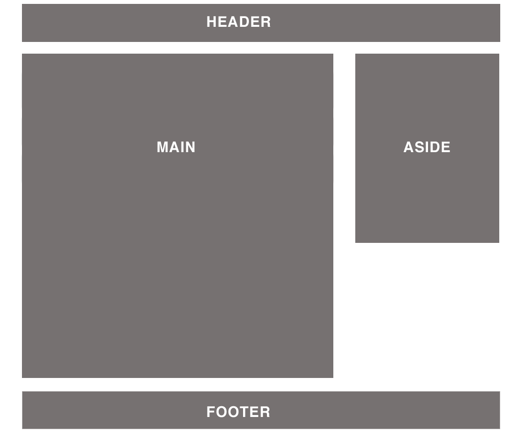
<header class="twelve columns">
<p>HEADER</p>
</header>
</div>
</div>
<!-- container -->
<!-- Included JS Files -->
<script src="javascripts/jquery.min.js"></script>
<script src="javascripts/foundation.js"></script>
</body>
</html>Couple that with the app.css file, like so:
html,
body {
  color: #fff;
  font-family: Helvetica, sans-serif;
  font-size: 30px;
}

header {
  background: #ccc;
  height: 100px;
  text-align: center;
}
That should give us our roughed out grey header area. If we examine our HTML a few items should jump out. Mainly that we're using classes like .container, .row and .twelve .columns. These are all part of Foundation's grid system which seperates major sections into subcategories to help with organization and layout. The documentation explains it better than I can:
The grid is built around three key elements: containers, rows, and columns. Containers create base padding for the page; rows create a max-width and contain the columns; and columns create the final structure.
Since Foundation uses a twelve column grid system, specifying that an item is .twelve .columns means it will stretch to be the full width of its row. By default a row's maximum width is 980px but we can change this if we want in the foundation.css file.
.row {
  width: 100%;
  max-width: 980px;
  min-width: 727px;
  margin: 0 auto;
}
/* To fix the grid into a certain size, set max-width to width */
With that knowledge we can go ahead and quickly mock up the other sections of our page.
<!DOCTYPE html>
<html lang="en">
  <head>
    <meta charset="utf-8" />

    <!-- Set the viewport width to device width for mobile -->
    <meta name="viewport" content="width=device-width" />

    <title>Responsive Grid Prototype</title>

    <!-- Included CSS Files -->
    <link rel="stylesheet" href="stylesheets/foundation.css" />
    <link rel="stylesheet" href="stylesheets/app.css" />

    <script src="javascripts/modernizr.foundation.js"></script>
  </head>
  <body>
    <!-- container -->
    <div class="container">
      <div class="row">
        <header class="twelve columns">
          <p>HEADER</p>
        </header>
      </div>
      <div class="row">
        <div class="main eight columns">
          <p>MAIN</p>
        </div>
        <aside class="four columns hide-on-phones">
          <p>ASIDE</p>
        </aside>
      </div>
      <div class="row">
        <footer class="twelve columns">
          <p>FOOTER</p>
        </footer>
      </div>
    </div>
    <!-- container -->

    <!-- Included JS Files -->
    <script src="javascripts/jquery.min.js"></script>
    <script src="javascripts/foundation.js"></script>
  </body>
</html>
And we'll need to update the CSS to match.
html,
body {
  color: #fff;
  font-family: Helvetica, sans-serif;
  font-size: 30px;
}

header,
.main,
aside,
footer {
  margin-top: 20px;
  background: #ccc;
  height: 100px;
  text-align: center;
}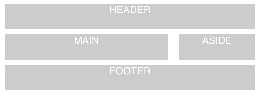
That wasn't so hard was it?
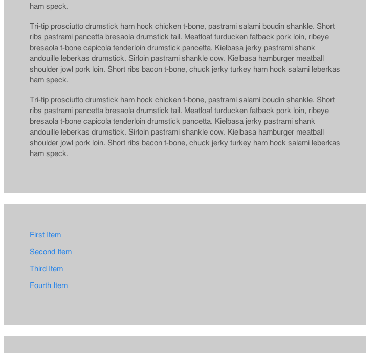
Let's throw in some dummy copy to make our columns expand so we can get closer to our original comp. For that we'll turn to Bacon Ipsum
<!DOCTYPE html>
<html lang="en">
  <head>
    <meta charset="utf-8" />

    <!-- Set the viewport width to device width for mobile -->
    <meta name="viewport" content="width=device-width" />

    <title>Responsive Grid Prototype</title>

    <!-- Included CSS Files -->
    <link rel="stylesheet" href="stylesheets/foundation.css" />
    <link rel="stylesheet" href="stylesheets/app.css" />

    <script src="javascripts/modernizr.foundation.js"></script>
  </head>
  <body>
    <!-- container -->
    <div class="container">
      <div class="row">
        <header class="twelve columns"></header>
      </div>
      <div class="row">
        <div class="main eight columns">
          <p>
            Tri-tip prosciutto drumstick ham hock chicken t-bone, pastrami salami boudin shankle.
            Short ribs pastrami pancetta bresaola drumstick tail. Meatloaf turducken fatback pork
            loin, ribeye bresaola t-bone capicola tenderloin drumstick pancetta. Kielbasa jerky
            pastrami shank andouille leberkas drumstick. Sirloin pastrami shankle cow. Kielbasa
            hamburger meatball shoulder jowl pork loin. Short ribs bacon t-bone, chuck jerky turkey
            ham hock salami leberkas ham speck.
          </p>
        </div>
        <aside class="four columns">
          <ul>
            <li><a href="#">First Item</a></li>
            <li><a href="#">Second Item</a></li>
            <li><a href="#">Third Item</a></li>
            <li><a href="#">Fourth Item</a></li>
          </ul>
        </aside>
      </div>
      <div class="row">
        <footer class="twelve columns"></footer>
      </div>
    </div>
    <!-- container -->

    <!-- Included JS Files -->
    <script src="javascripts/jquery.min.js"></script>
    <script src="javascripts/foundation.js"></script>
  </body>
</html>
While that expands everything nicely I'd like to add some padding to the mix. But as soon as I try to pad my .main div everything explodes! Turns out we need to make sure we're using box-sizing: border-box otherwise the padding will expand our columns and destroy our grid. For a deeper explanation of box-sizing: border-box checkout this great post by Paul Irish. With that addition our CSS should now look like this:
* {
  box-sizing: border-box;
}

html,
body {
  font-family: Helvetica, sans-serif;
}

header,
.main,
aside,
footer {
  margin-top: 20px;
  background: #ccc;
}

header,
footer {
  height: 100px;
}

.main,
aside {
  padding: 50px;
}
Making friends with mobile
Well I'm sure if you've made it to this point you're ready to see how this all works on an iPhone. A quick test you can perform is to just narrow your browser window until it is only about 300px wide (the iPhone has a roughly 320px display area, I believe). As you do so the columns should narrow, reflowing their content as they do so. Eventually our aside will pop from its current position and line up underneath our .main content.
But what if we don't want the sidebar to appear on a mobile phone? Perhaps we just want to show the .main content if the screen is too narrow. Easy! Foundation provides some nice helper classes which we can use to toggle elements on or off depending on the device. We'll just add a .hide-on-phones class to our aside
<aside class="four columns hide-on-phones"></aside>and...voila! The aside disappears on small screens!

Nice and simple, yeah? If you'd like to checkout the project running live you can follow this link. Resize your browser or hit it with an iPhone to see it do its magic. Also you can grab the source code off of Github. Enjoy! - Rob
You should follow me on Twitter here.
- Mood: Relaxed
- Sleep: 7
- Hunger: 0
- Coffee: 0