Building better accessibility primitives
As the sites we build increasingly become more app-like it’s important that the platform keep up and give component authors the tools they need to build rich accessible experiences.
Recently I’ve run into two situations where it was extremely difficult for me to add proper keyboard support to the components I was building. After a lot of experimentation and research it became clear that maybe there were some missing primitives in the web platform that would have made my work a bit easier. I’ll explain the two scenarios here and cover some ideas for how to solve them.
Problem 1: Modals
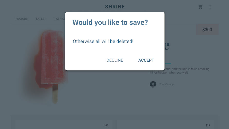
A modal window is a dialog that appears above the page, often obscuring content behind it with an overlay. The idea is that if a modal is displaying the user should not be able to interact with anything else on the page.

For anyone who has ever tried to make a modal accessible you know that even though they seem pretty innocuous, modals are actually the boss battle at the end of web accessibility. They will chew you up and spit you out. For instance, a proper modal will need to have the following features:
- Keyboard focus should be moved inside of the modal and restored to the previous
activeElementwhen the modal is closed - Keyboard focus should be trapped inside of the modal, so the user does not accidentally tab outside of the modal (a.k.a. “escaping the modal”)
- Screen readers should also be trapped inside of the modal to prevent accidentally escaping
Nailing the above three points can be pretty difficult and requires a lot of contortions using combinations of aria-hidden to trap the screen reader and managing focus to trap TAB. Here’s one of the best examples I’ve found. Note that this example assumes your modal is a sibling to the rest of your main content so you can easily apply aria-hidden to main. If, however, your modal is mixed in with the rest of your main content (maybe for positioning reasons) then you are seriously screwed. You’ll need to find a way to put aria-hidden on everything in main that isn’t your modal (or a parent of your modal). It definitely feels harder than it should be.
What about <dialog>?
The HTML spec does mention the idea of a <dialog> element which would magically solve all of the above issues. The problem is that so far only Chrome has implemented it, and other browsers seem disinterested. Furthermore, <dialog> may not be the right solution. Let’s consider another example:

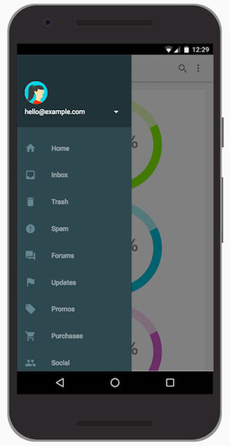
Offscreen drawer menus are an extremely popular UI pattern in responsive sites. But is an offscreen drawer menu the same as a <dialog>? The drawer also needs to comply with the three bullet points listed above but calling it a dialog feels like a stretch. My hunch is many developers might not think to reach for <dialog> when they’re building a drawer.
Possible solution: blockingElements
Rather than contort <dialog> to do our bidding, why not expose a JavaScript API that gives us all the same magical goodies. Then we could create our own custom elements and leverage the API as we see fit. This idea has been discussed over on the whatwg/html GitHub repo, under the thread “Expose a stack of blocking elements”.
The proposed API could look something like this:
// put element at the top of the blocking elements stack
document.blockingElements.push(element);
document.blockingElements.pop();
// see https://github.com/whatwg/html/issues/897#issuecomment-198565716
document.blockingElements.remove(element);
document.blockingElements.top; // or .current or .peek()
Putting an element at the top of the stack effectively means everything else on the page is inert (so no risk of the keyboard or screen reader “escaping”). And when an element is popped off of the stack, focus naturally returns to the previous activeElement. This allows us to explain the behavior of <dialog> so component authors can use it to build whatever they like, which dovetails really well with the whole extensible web movement. A natural side effect of doing this is we get tons of accessibility features for free. Developers wouldn’t need to sprinkle the page with aria-hidden attributes or write keyboard traps, instead they would use the best API for building a dialog and good accessibility would naturally come out of that. It’s a total win.
At the moment blockingElements is still a new idea, and new ideas are fragile, so please resist the urge to hop on that GitHub issue and bikeshed the heck out of it 😊 Our next step is to move blockingElements into a Web Platform Incubator Community Group (WICG) so we can continue to iterate on the idea. When we move to the WICG I will be sure to update this blog and let you all know!
Problem 2: Disabling tabindex
Let’s go back to that offscreen drawer example for a second. In order to animate that drawer on screen, and achieve a 60fps animation, I’m going to need to promote the drawer to its own layer using something like will-change: transform. Now I can transform the drawer on screen and I shouldn’t trigger unnecessary paints or layouts. This technique is explained really well by Paul Lewis in his I/O presentation.
One problem: to do this we must leave the drawer in the DOM at all times. Meaning its focusable children are just sitting there offscreen, and as the user is tabbing through the page eventually their focus will just disappear into the drawer and they won’t know where it went. I see this on responsive websites all the time. This is just one example but I’ve also run into the need to disable tabindex when I’m animating between elements with opacity: 0, or temporarily disabling large lists of custom controls, and as others have pointed out, you’d hit if you tried to build something like coverflow where you can see a preview of the next element but can’t actually interact with it yet.
What about aria-hidden?
Using aria-hidden it’s possible to remove an element and all of its children from the accessibility tree. This is awesome and solves the problem for screen readers (Marcy Sutton pointed out that it doesn’t completely solve the issue for screen readers and can even lead to “ghost controls” which are focusable but lacking a11y information). Unfortunately ARIA is forbidden from affecting page behavior, it only deals with semantics, and there is no similar concept for tabindex. This is important because there are sighted users with motor impairments who rely on the tab key to navigate the page. If you have a complex tree of interactive elements and you need to remove all of them from the tab order your only option is to recursively walk the tree (or write a pretty heinous querySelectorAll string) and set every focusable element to tabindex="-1". You also need to remember any explict tabindex values they may already have and restore those when the element is back on screen. Again, it feels harder than it should be.
What about pointer-events: none?
Settings pointer-events: none will make it so you can’t click on an element but it doesn’t remove it from the tab order and you can still interact with it using the keyboard.
What about setting the drawer to display: none?
When the drawer is offscreen we could set it to display: none or visibility: hidden. That would remove the focusable children from the tab order. Unfortunately that will also destroy our GPU layer which kind of negates the whole animation technique. On a simple enough drawer we can actually get away with recreating the layer right when the user opens it, but for a more complex drawer (like the kind on m.facebook.com) all of that painting would probably cause our animation to jank. I don’t think developers should have to choose between 60fps animations and good accessibility.
Possible solution: inert=""
Previously there was some discussion around adding an inert attribute to HTML. The basic idea is you could set the inert attribute on an element, and its entire tree of descendants would become non-interactive. This is perfect for our drawer example as it means we could paint something offscreen, set it to inert, and not have to worry about a keyboard user accidentally interacting with it.
Unfortunately the original use cases cited for inert seem to orbit mainly around dialogs and since there was already a <dialog> proposal floating around at the time, it was punted.
My feeling is this is perhaps backwards. I think the proposed blockingElements API would be a better way of letting developers build accessible dialogs because it says “everyone else BUT ME is inert”. Whereas inert="" would be useful for the animation example above where I need something to be painted and in the DOM but also be non-interactive (in other words, “I AM inert”). And for anyone doing accessibility work it becomes like a more powerful aria-hidden because presumably it would not only remove an element from the tab order but also from the accessibility tree. Developers would use the best API to build their component and they’d get good accessibility for free. ZOMG SO FULL OF WIN!
I should add that others on the discussion thread mention that maybe this would be better solved with a new CSS property. I’d be cool with that as well but to my (very limited) knowledge no proposal has come forward and this is a legitimate pain point for developers. So I’ve filed a chromium bug to see if the Chrome team will explore restarting the process of implementing inert. I hope by documenting these use cases we can convince others of its utility. If there’s progress I’ll be sure to write a follow up post to let you all know 🐝