Command palettes for the web
A while back I was working with a fellow Googler to try and improve the accessibility for one of our apps. In the scenario, a user needed to click some UI, which then opened a panel, where the user needed to click more UI to perform an action.
Helping a screen reader navigate these various UI states is a tricky technique known as focus management.Focus management is when you manually direct the user’s keyboard and screen reader cursor as they use the app. For example, if clicking a piece of UI loads more content into the page, then you need to tell the screen reader that this new content is available.
Because the web does not have a built-in tool for doing focus management, this is often left as a design exercise involving clever uses of tabindex, the focus() method, and a lot of guesswork.
Look up
As my teammate and I were discussing how to move focus into the next panel, he mentioned something that got me thinking. He said that he wished web apps had menu bars like desktop apps.
You know, like the File and Edit menus in Outlook. I can do anything I want with those!
It had never occurred to me how much I take the OS menu bar for granted and how powerful of an accessibility tool it can be. Instead of forcing the user to learn a bunch of UI states—which are different for each app—the menu bar is a common affordance for executing commands.
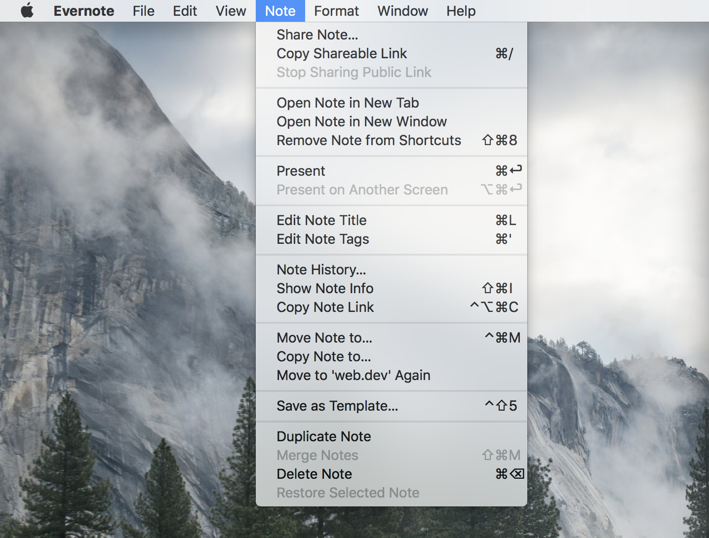
So why don’t web apps have menu bars? Especially if they could improve the accessibility for our users?
There might be a few reasons for this:
- The OS menu bar is presented separately from the app, which lives in a window. Web apps don’t have this capability because they run inside of a browser which already has a menu bar.
- In addition to the browser’s menu bar, there’s also a URL bar and associated controls. Adding another menu bar may feel cluttered.
- Every website would have to solve this for themselves. It would be hard to create the consistent experience of OS menu bars.
It’s worth noting that some web apps do support their own menu bar—Google Docs for example—but I think that’s because they’re following in the well worn footprints of their native counterparts.

In general the menu bar is not a common pattern across the web. Instead, we tend to hide controls behind hamburger menus or cryptic settings icons. So if it’s design prohibitive to add menu bars to every web app, is there a better alternative?
Help!
One of the most interesting and (literally) helpful buttons in the menu bar is Help. In particular, the Search field in the Help menu which acts as a command palette. Start typing in a command, and it will find it for you.
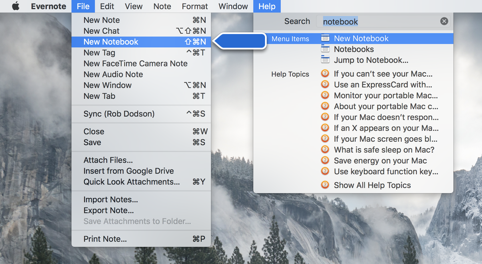
You can reach commands that do not have an associated keyboard shortcuts this way. And fuzzy search lets you guess the name of the command if you’re unsure.
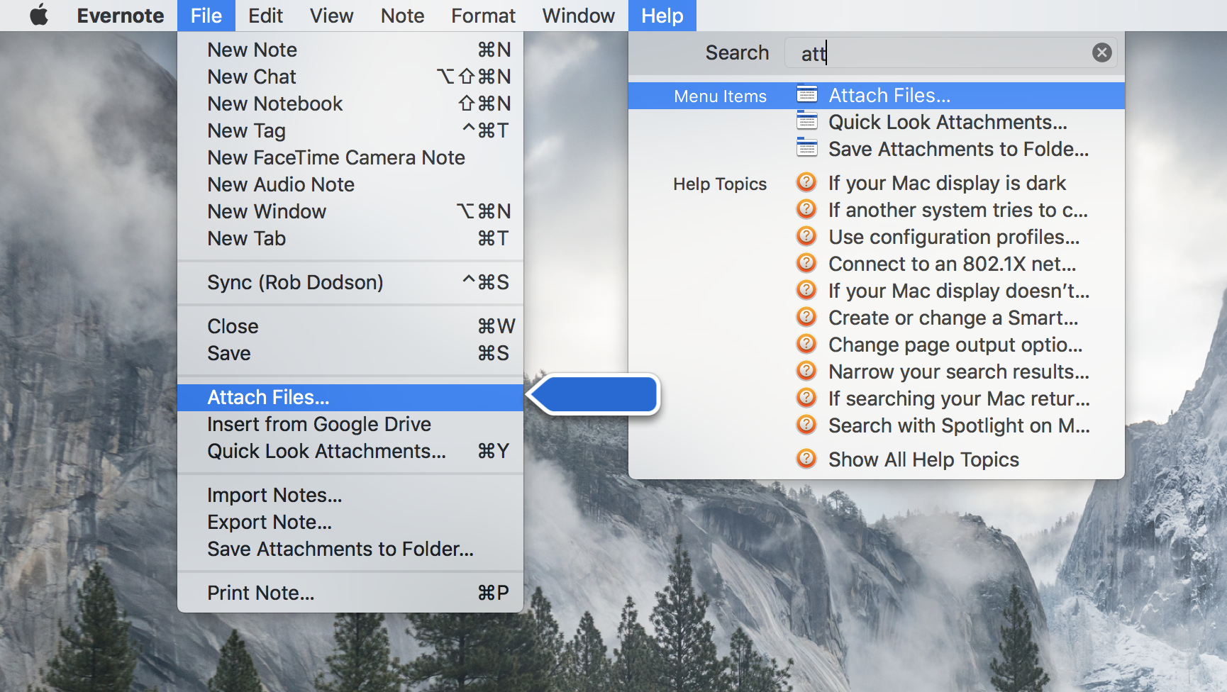
On the Mac you press CMD + SHIFT + / to open the Help menu. This means a user only needs to know one shortcut to access most of the functionality of any desktop app!
Thinking about this made a little lightbulb go off in my head 💡
Why don’t web apps use command palettes to emulate the best parts of the OS menu bar? They’re a simple UI—just a modal autocomplete—that could have a big impact for users!
An example
As a Googler, I live inside of the Gmail web app. Because the app has so much functionality, the Gmail team has provided a large set of keyboard shortcuts.
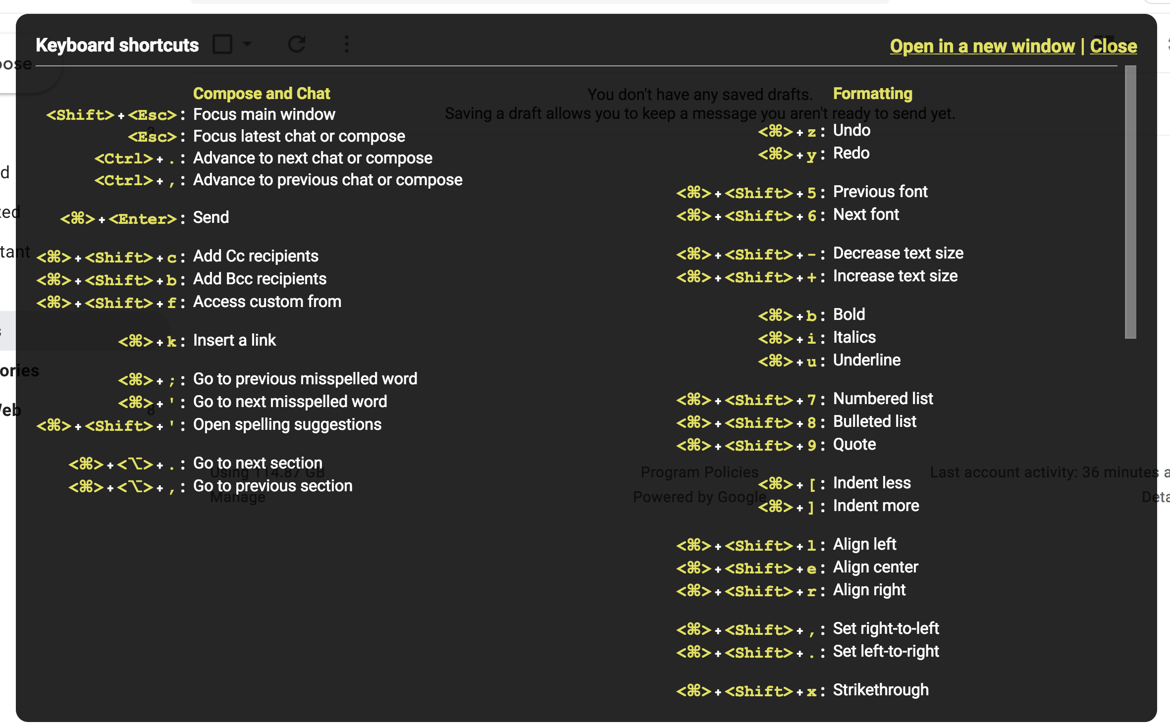
But shortcuts can be difficult to remember and typically only cover a subset of the functionality of an app.
Adding a Gmail filter is a task I do occasionally, but not frequently enough to remember a keyboard shortcut (btw, there isn’t one). And I always forget which settings menu it lives in. As it turns out, the command to add a filter is buried a few screens deep, creating a focus management conundrum. Wouldn’t it be a better experience if I could type CMD + SHIFT + P and "filter" to go straight there?
Could this improve the experience for users of assistive technology by giving them direct access to all of the commands an app supports—especially those tucked away in hard to discover modals and submenus?
While it’s important to still do the work of managing focus between states; providing a command palette as an additional affordance might have a big impact on UX.
Has this been tried before?
Sort of.
Alice Boxhall showed me both the command and menuitem elements which were designed for creating custom context menus. Similarly there is the contextmenu event which you can use today to create your own custom menu—but the event only fires if the user right-clicks or presses the context menu key.
I think the context menu route is not the path we want to take.
I think what we want is closer to what VS Code and other editors provide. A fuzzy search text field that can be summoned by a single command.
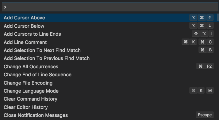
How we go about doing this is an open question. My naive guess is that we might want browsers to standardize a command palette keyboard shortcut, like CMD/CTRL + SHIFT + P that triggers a commandpalette event. Triggering this event could also be done directly through assistive technology in whatever way is most efficient for the user.
It would be nice if there was a built-in, easy to style HTML element for handling the fuzzy text input, but designing that is its own can of worms 😅
Closing thoughts
Focus management is hard and there’s no agreed upon way to do it. While it is important to ensure that every UI state in your app is keyboard and screen reader accessible, it feels like command palettes could be a nice, additional UI affordance that all users would benefit from.
I’m curious to know if this idea resonates with folks. Let me know your thoughts on twitter and thanks for reading!